Overview
Purpose
Our purpose first will be to show what we do in and out of the river in this beautiful
sport of Rafting with a wide gallery of images which we will always keep updated, in order
to attract more customers with the images shown. It is planned that these images can give us
that adventurous stupir and an injection of adrenaline that we need to want to venture into Rafting.
The second purpose of this site is become the beginning of each adventure with us, providing
information, location and hours as well as telephone and email contacts in which our users
can contact us to schedule their adventures.
Audience
Our audience is defined and we do not intend it to be very large, since rafting is an extreme sport, we intend to cover a audience for middle-aged people between 15 and 45 years old. They generally access from mobile devices such as smartphones and tablets, mainly students who are looking for new extreme adventures and have no problem traveling long distances to visit us, since we hope to have an international audience that comes to us looking for a new adventure. To cover a more international audience we plan various activities with foreigners and we hope to be a multicultural business.
Branding
Website Logo

Style Guide
Color Palette
Palette URL: https://coolors.co/042a2b-5eb1bf-54f2f2-fcfcfc-f4e04d
| Primary | Secondary | Accent 1 | Accent 2 |
|---|---|---|---|
| [#042A2B] | [#5EB1BF] | [#FCFCFC] | [#F4E04D] |
Typography
Heading Font: Alfa Slab One
The font is the same used in the logo, which generates a uniformity in the text and harmony with the logo, generating a better visualization. It is an easy access font and dares our public with an innovative and modern design, it gives the feeling of being very suitable for the sport that will be practiced. Its style helped us to decorate easily what we see on screen, so it is easy to read and helps us to better understand the content of the page, it has a good spacing too and the default size is easy to adjust. So it was chosen as our font for titles
Paragraph Font: Montserrat
This font is easy to read and it goes well with the heading font, which generates uniformity in the text and harmony in the web page design. It contrasts perfectly with our font for titles and helps us to have an easy reading and visualization, it does not also offer an easy distinction and display of the text itself. It looks quite youthful and attentive to our public since it helps them feel outside of what is commonly used or established. The font transmits the adventurous spirit that we need and finally its design is easy to modify and adapt according to the needs of the page.
Normal paragraph example
The best Whitewater Rafting in Colorado, White Water Rafting Company offers rafting on the Colorado and Roaring Fork Rivers in Glenwood Springs. Since 2020, we have been family owned and operated, rafting the Shoshone section of Glenwood Canyon and beyond.
Colored paragraph example
Trips vary from mild and great for families, to trips exclusively for physically fit and experienced rafters. No matter what type of river adventures you are seeking, White Water Rafting Company can make it happen for you.
Navigation
Site Map
The Site Map of a site is just like it sounds…it is a map of the pages in a site and how they are related and linked together. From the map above we can see that we will eventually have the Home page and 2 sub or child pages.
The lines that connect them all together indicate that each page should be accessible from any other page, it is essentially showing us the global navigation for the site.
Wireframes
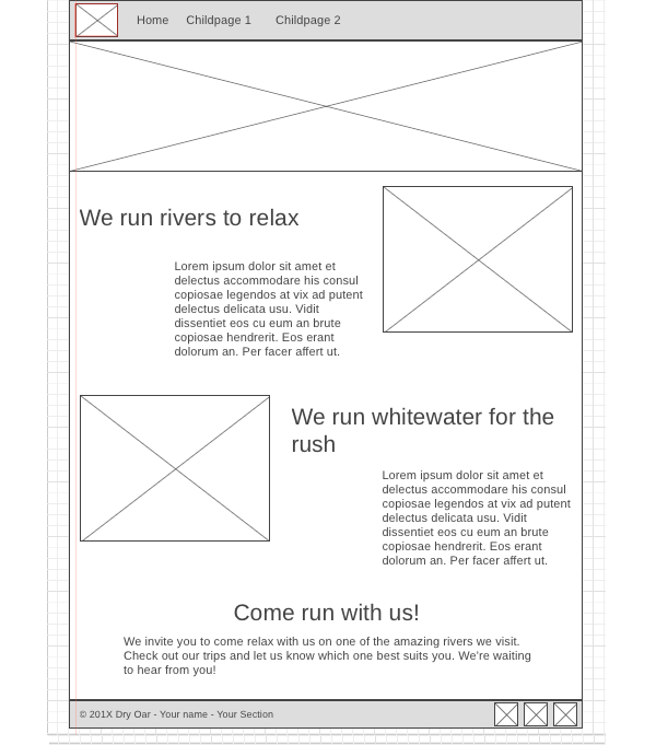
Wireframes are like blueprints for making webpages. They should show the major sections of content that will be on the page and the relative locations of each element. In the wireframe below you can see there will be 6 sections to our page:
- At the top we have a section with the logo (the box with the mountain means an image) and the navigation bar.
- Then there is a banner image that stretches all the way across the screen.
- Next we have some text and an image
- ...followed by another row made up of an image and some text.
- Then one more section of text with no image.
- Lastly, a footer containing a copyright/name line and 3 social media icons.
